Tuesday, November 23, 2010

Prints... of a different kind.

I have some prints in the Wilgus gallery show "delicate!" I love pretending to be a photographer!

ANYways, here is an online version:


These are pretty hard to look at, to be honest, and were even harder to edit. This diptych is from this past august, when my grandpa was dying, and I was unconsciously photographing the whole process (in the sense that I was taking a TON of pictures of everything, and wasn't thinking about why, but now I realize that it was to record this occasion so i'll never forget it). It was this long, drawn-out experience and I had never experienced anything quite like it - everyone was just hanging around my grandparents' house in this weird state of limbo. All of us were pretty delicate - I remember feeling fragile as glass - one little thing would set any of us on a crying jag at any given time, even if we thought we were being strong. Death is a strange thing. 

Anyways. That's that.

Sunday, November 21, 2010

New Pryntz

Here is some of my brand new print work - i'm trying out this new thing called "updating my blog while things are actually happening." ha ha.


This one is my very first etching! 


This one is drypoint on PVC then relief rolled.


This is the same as above, but i cut the pvc and made shapes. this one is a bitch to print. you kind of have to look at it up close to see what's going on.... but it was my first time trying this process so i'm proud of it anyway. Haha. 

Monday, November 15, 2010

This is the original collage thing for the cake cover :)


just thought it was interesting. Again, drawings from my sketchbook collaged together and colored :)

pryntz

These are just a couple of my prints! Sorry for the bad picture quality, I haven't had the time to get really quality pictures of them yet. but hopefully from these you'll get the idea. 

Drypoint on PVC for Intro to Print Media

Drypoint on PVC that I actually did for IL Concepts 1


Monotype

Monotype


More monotypes! 


This is a very small number of the things that I have produced for that class, and I'll update with more later :)

wooooo

Here are some projects from Illustration concepts:


This project was to redesign a cover for any band... So I chose the band Weather Report, and their album Black Market. This one's entirely photoshop. 


This one was just some silliness that I did after the constitution day lecture. It was a panel on gay marriage with Sharon Hayes, Dan Savage and Dr. Kendall Thomas. I think this piece pretty much sums up what I thought of the panel. 


This is an ad campaign for Converse. 'nuff said. Graphite and photoshop! 


These were illustrations (one cover, 2 spot) for an article on the NYTimes book review for the book "freedom" by Jonathan Franzen. This was the very first assignment of the year I did - don't judge me! This one's all graphite.


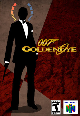
This one's a cover redesign for the game "Goldeneye." All photoshop! 


And lastly, this one was a cover for an article called "Is America Islamophobic?" 
graphite and watercolor, collaged in photoshop.


pheeeeeeeeew! lots of stuff! 


Update Tiem.

Sorry for being such a sloth all year (all 2.5 months of it... pff). My My, I can't believe the semester has gone so fast.

That said, here's some work from Fine Art Illustration:


These are a CD cover package redesign for the band CAKE. The album is called "B-Sides and Rarities." (heh. heh. get it?) They're both drawings in graphite, scanned in and colored in photoshop.


This is an editorial piece for the article called "whitewash in wartime" (you can read the article here)
It's basically about government propaganda during wartime, and how they manipulate the thinking of the public by being selective in their portrayals in the media. 
the line drawing was done in graphite, then scanned and colored in photoshop.

Next post Illustration concepts!